Creating Your First Blog With TALL - Part Six

Hello! Welcome to this tutorial series. First of all, sorry for the delay in publishing this tutorial. I was quite busy for the last week and couldn’t do it. Fortunately, I’m back this week to continue where we left.
This tutorial will build upon the previous episode. Remember you were able to create the home, item and categories pages using Livewire components in the last episode. You learnt how to display all posts in the homepage and show posts from a particular category in the categories page. You also learnt how to reuse Livewire components at multiple places by using the post item component in both the home and category pages.
In this episode, you’ll turn your focus to displaying the details of individual posts. When you click a post from either the home page or the category page, the details page shows the details of the post.
At the end of this episode, you should be able to:
- run select queries for a single row from the database using Eloquent.
- use Tailwind CSS to create a responsive layout for a post.
- create a mobile-first top navigation bar and nav menu for any website using Tailwind CSS.
- use Alpine.js to make the navigation menu mobile-friendly.
OK, let’s start our journey.:)
Creating the Detail Component
When a user clicks a post in either the home page or categories page, the person should be redirected to the Detail page. This is where they’ll be able to read the post.
Technically speaking, the link to the detail page will pass the post’s slug along and this will be captured by the Laravel Router and then passed to the Detail Component. This is what you’ll use to retrieve the post from the database.
Enter the command to create the Detail component:
php artisan make:livewire DetailNow open the Detail component from app/Http/Livewire. Make sure it contains this code:
<?php

namespace App\Http\Livewire;

use App\Models\Post;
use Livewire\Component;

class Detail extends Component
{
    public $post;

    public function mount($slug)
    {
        $this->post = Post::firstWhere('slug', $slug);
    }
    public function render()
    {
        return view('livewire.detail')
            ->layout("layouts/guest");
    }
}
First of all, you’re using the Post model. You used the firstWhere method to get the post by its slug. This ensures only the first post matching the slug is returned(you’re sure the post is what you asked for because each post has a unique slug).
If you can remember, in the last episode I made mention that Livewire automatically makes public properties in a component available in the view. Therefore, the $post member variable is readily available in detail.blade.php.
We also said that the mount method is called once the component is mounted. Therefore, it is the best place to initialize properties, run database queries and carry out other initialization in the component. When you bind a route with parameters to a Livewire component, the mount method can also be used to capture the argument(s) from the route and make them available to the component.
This is exactly what you’ve used the Detail component’s mount method for - to capture the $slug parameter passed to the route.
Since the $post variable is available in the detail view, we now have to edit the resources/views/livewire/detail.blade.php view file to display the post.
Open the view file and enter this code into it:
<div class="mx-auto md:w-4/5 lg:w-3/5">
    <h2 class="mt-2 text-xl font-bold lg:text-2xl">
        {{ $post->title }}
    </h2>
    <div class="flex flex-row my-3">
        <div class="mr-2 text-gray-700">
            {{ $post->user->name }}
        </div>

        <div class="w-2 h-2 my-auto mr-1 text-xl
          bg-gray-300 rounded-full"></div>

        <div class="my-auto mr-2 text-sm
          text-gray-500" title="Category">
            {{ ucwords($post->category) }}
        </div>

        <div class="w-2 h-2 my-auto mr-1 text-xl bg-gray-300
          rounded-full"></div>

        <div class="my-auto text-sm text-gray-500">
            {{ $post->published_date }}
        </div>
    </div>
    <img src="{{ asset("storage/posts/$post->featured_image") }}"
      alt="{{ $post->title }}"
       class="w-full my-4 rounded-sm max-h-96">
    <div>
        {!! $post->body !!}
    </div>
</div>
This is what each class utility means from the view:
mx-auto: centers the element it’s been applied to on the horizontal axis. This is the same as applyingautoto bothmargin-leftandmargin-right.my-autowill center it in vertical direction whilem-autodoes same on both axis.w-{number}applieswidth: {number}to the element andh-{number}also appliesheight: {number}.- The
sm:,md:,lg:prefixes apply responsive variants of the utility classes. Somd:w-4/5makes this element occupy 4/5th of the screen size in medium-sized devices. m{side}-{number}is used to set margin of size{number}to{side}. The value for{side}can betfor top,bfor bottom,rfor right,lfor left,xfor horizontal,yfor vertical or nothing at all to represent all sides.text-xlandtext-2xlmakes the text extra-large and extra-extra-large(2x extra-large). Other text size utilities includetext-xs,text-sm,text-base,text-lg,text-3xlup totext-9xl.- I discussed
flexandflex-rowin the previous episode. As a reminder, these arrange children of the element in a flex row. - All other utilities have been discussed before in the previous episodes.
Routing to the Detail Page
Now that the detail page is ready, all you have to do is change the action for the post-detail route. Open the routes/web.php routes file and change the post-detail named route from this:
Route::get('{slug}', function ($slug) {
    return view('welcome');
})->name('post-detail');
to the following:
Route::get('{slug}', Detail::class)->name('post-detail');Save all the files and start both your database server and the built-in PHP server. The latter can be started with this command if you’ve forgotten:
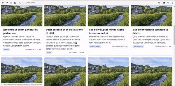
php artisan serveNow you should be able to see something like this if you click any post from the home page:
Creating a Navigation Bar for the Tall Blog
Though our blog is able to display pages as expected, wouldn’t it be nice if you could navigate to the categories page and back to the home page without using the browser’s back button? Or, perhaps, from the detail page to either categories or home pages? This would not only improve the user experience of the blog, it would also make it consistent with other websites on the internet.
Consequently, you’re going to create navigation component for the navbar. However, this is not going to be a Livewire component: it’s going to be a Laravel component. It’s going to be a Laravel component because that’s more suitable for such cases than a Livewire component.
Create an anonymous nav component in the resources/views/components directory. Name it nav.blade.php and put this code into it:
<nav x-data="{ isOpen: false }" @keydown.escape="isOpen = false"
    class="z-10 flex flex-wrap justify-between w-full p-4 shadow-md">

    <div class="mr-6 text-xl font-bold">
        <a href="{{ route('home') }}"
        class="grid grid-cols-3 gap-1 transition duration-500 hover:text-purple-500">
            <x-jet-application-logo class="w-8 h-8 border border-blue-300 rounded-full" />
            <div class="col-span-2">Tall Blog</div>
        </a>
    </div>
    <button x-on:click="isOpen = !isOpen" type="button" class="px-2 lg:hidden"
        :class="{ 'transition transform-180': isOpen }">
        <svg class="w-6 h-6 fill-current" xmlns="http://www.w3.org/2000/svg" viewBox="0 0 24 24">
            <path x-show="isOpen"
                d="M18.278 16.864a1 1 0 0 1-1.414 1.414l-4.829-4.828-4.828 4.828a1 1 0 0 1-1.414-1.414l4.828-4.829-4.828-4.828a1 1 0 0 1 1.414-1.414l4.829 4.828 4.828-4.828a1 1 0 1 1 1.414 1.414l-4.828 4.829 4.828 4.828z" />
            <path x-show="!isOpen"
                d="M4 5h16a1 1 0 0 1 0 2H4a1 1 0 1 1 0-2zm0 6h16a1 1 0 0 1 0 2H4a1 1 0 0 1 0-2zm0 6h16a1 1 0 0 1 0 2H4a1 1 0 0 1 0-2z" />
        </svg>
    </button>
    <div class="flex-grow w-full transition-all duration-500 ease-in lg:flex lg:items-center lg:w-auto"
        :class="{ 'block shadow-3xl': isOpen, 'hidden': !isOpen }" @click.away="isOpen = false" x-show.transition="true">
        <ul class="items-center justify-end flex-1 pt-4 space-y-4 lg:pt-0 list-reset lg:flex lg:space-y-0">
            <li class="py-2 md:py-0">
                <a href="{{ route('home') }}" class="mx-4 text-lg hover:text-indigo-500">Home</a>
            </li>
            <li class="py-2 md:py-0">
                <a href="{{ route('home') }}" class="mx-4 text-lg hover:text-indigo-500">
                    Login
                </a>
            </li>
        </ul>
    </div>
    </div>
</nav>
This code is pretty large. But don’t worry, apart from a few snippets you’ve encountered most of the others before.
From the code:
- The first attribute in the
navelement is an Alpine.js attribute. What it does is that it defines a variable calledisOpenwith an initial boolean value offalse. This is used to toggle the navigation menu on mobile devices. - The
@keydown.escape="isOpen = false"is also an Alpine.js snippet that sets theisOpento false when the Escape key is pressed while the nav menu is open on mobile. This will close the menu. - Next is the
classattribute. Again, this makes use of Tailwind CSS utilities a lot. Explanation each utility is as follows:z-10sets thez-indexCSS property. Accepted values are within [z-0,z-10,z-20,z-30,z-40,z-50andz-auto].flex-wrapis the Tailwind way of applyingflex-wrap: wrapto a flex element.- all the other utilities have been looked at already.
- The next
divelement serves as a container for the logo and site title. Thefont-boldutility you applied to it here makes the title font bold. Here are the others:- We decided to display the logo and site title in a grid of three columns with a gap between them(indicated by
grid grid-cols-3 gap-1). - Also, the
transition duration-500 hover:text-purple-500adds a purple color transition of length 500ms to the title text on hover. - The
application-logoJetstream component has been reused here and is almost similar to the way you used it in the second episode. The only difference now is that you have added a blue border(indicated byborder border-blue-300) to it. - The site title is the last element in this container. It takes two of the three grid columns, as indicated by the
col-span-2utility class.
- We decided to display the logo and site title in a grid of three columns with a gap between them(indicated by
- Our next element is the button that displays and hides the menu on mobile devices:
- You applied the
x-on:clickAlpine.js handler on it. This fires theonClickevent, giving you the chance to toggle theisOpenvariable (isOpen = !isOpen) to its opposite value(from true to false or vice versa). - By specifying
lg:hiddenyou’re hiding this element on large screen devices. - The next encounter is the
:classAlpine.js attribute. This appends the values you define within it to the element’sclassHTML attribute, allowing you to add certain classes based on JavaScript variables. You’ve made use of this by adding a 180-degrees transform and transition to this button whenisOpenis true. - The SVG element is made up of two path objects - a close sign and a hamburger sign representing closed and opened states of the menu, respectively. Thus, the first sign (close) is shown when
isOpenis true while the second sign (hamburger) is shown whenisOpenis false.
- Finally, we come to the
divthat contains the menu. The only new things here(on the Alpine side) are the attributes@click.away="isOpen = false"andx-show.transition="true". The@click.awayimplies clicking away from thisdivcloses the menu(it setsisOpento false).x-show.transition="true"adds transition to the element when it’s showing.
Now add the nav component to resources/views/layouts/guest.blade.php layout file:
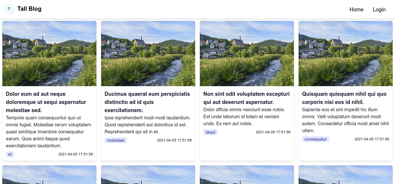
<x-nav/>This should come just after the opening body tag. Save all files and reload your webpages to see the navigation bar:
This brings us to the end of this episode. In our next episode, we’ll create and set up the pages making up the dashboard for the blog.

